Diagramme für Reports
Du kannst deinen Reports jetzt Diagramme hinzufügen.
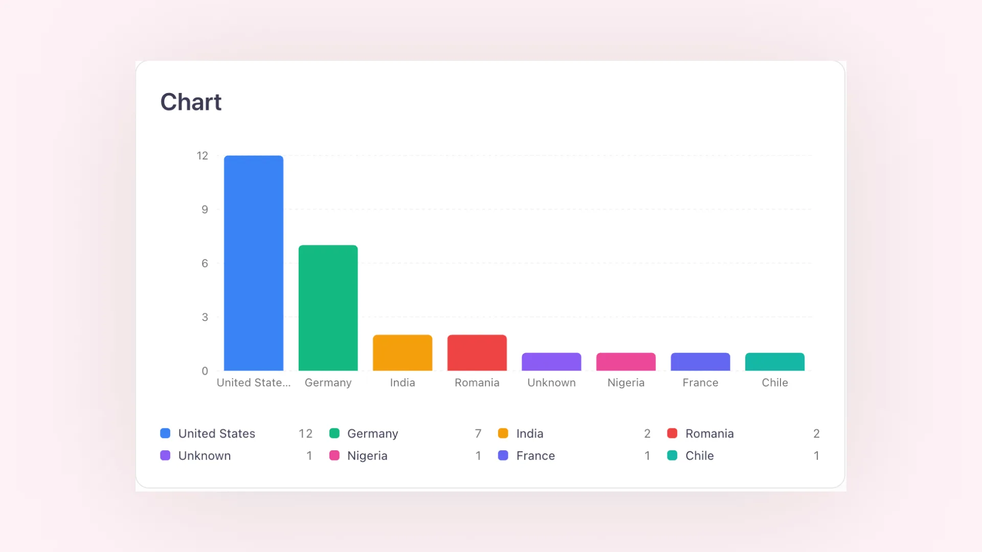
Wähle ein Donut-, Balken- oder Liniendiagramm, um zu zeigen, wie sich deine Berichterstattung zusammensetzt, nach Medium, Land, Kanal oder Schlagwort, oder wie sich eine Kennzahl wie der Medienwert über die Zeit entwickelt. Jedes Diagramm ist ein eigener Report-Block mit eigenen Filtern.
Im Web sind die Diagramme interaktiv: Fahre über ein Segment, um den genauen Wert zu sehen. Der PDF-Export zeigt dieselben Diagramme und Legenden, sodass dein Report gleich aussieht, egal ob du einen Link teilst oder die Datei versendest.