What Makes an aclipp Report Unique?
With our aclipp tool, we provide our users with a unique report generator in the market. It enables you to create a perfect and customer-specific PR report in less than 4 minutes. All without manual work, hours of building presentations, and a lot of stress.
The structure and design of the report result from surveys of over 1,000 PR managers across four market studies and countless discussions with PR experts from the entire DACH region. What we have come up with and why we structured the report this way, you will find out in the next four minutes (as long as it takes to create a report 😉):
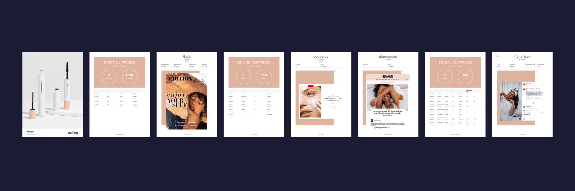
Basically, aclipp reports have three main components - the channel summary, detailed clippings, and performance evaluation with charts. How is everything structured in detail? Let me show you! ⬇️
Channel Summary
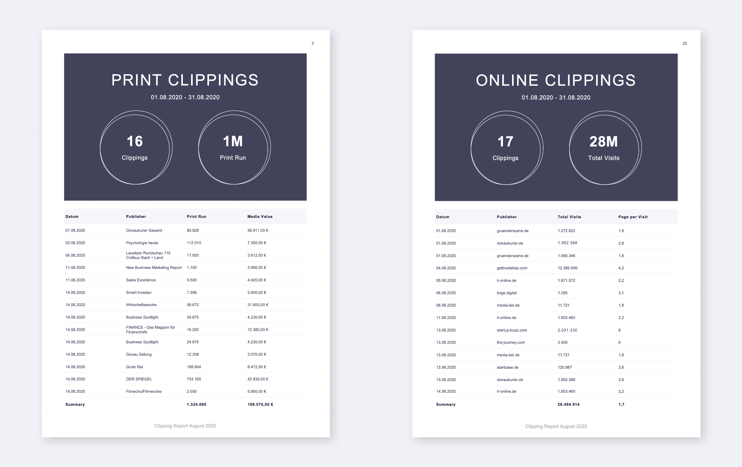
These slides mainly provide a quick overview of the channel's performance (e.g., print, online social media, TV, podcast, etc.). Therefore, all mentions from the period are listed in a table, including the most important KPIs. Additionally, the metrics are summed up or averaged. Which metrics are included is determined individually for each customer in the report generator.
Furthermore, the layout is chosen so that the number of clippings stands out immediately. Another metric can also be highlighted. Ideally, this should be a metric that is particularly noticeable or important. Which one it is depends on the user's individual goals. It could be reach, media value, engagement, or sentiment. This is a factor that makes the report so unique.

Detailed Clippings
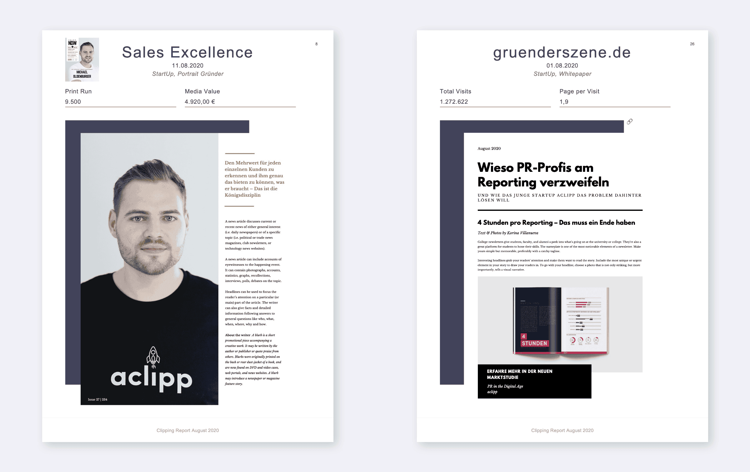
After the summary, the clippings are displayed in detail. Care is taken to list all important KPIs clearly and understandably. Nevertheless, the clipping itself should be the focus and easy to read.
Which KPIs are listed here is again up to the creator and absolutely customer-specific. Our users can ensure the report directly contributes to achieving PR goals. They can show how their excellent work has brought them closer to communication and business goals.
In addition, for online and social media clippings, a link to the post/article is provided, so the entire clipping does not need to be displayed in the report and can also be read live. For print clippings, the media monitoring cover can be added to provide additional information about the magazine or newspaper issue.
Here, the reader finds all the important information about a clipping at a glance and knows exactly in what context the brand was mentioned - without being overloaded with too much information.

Performance Evaluation with Charts
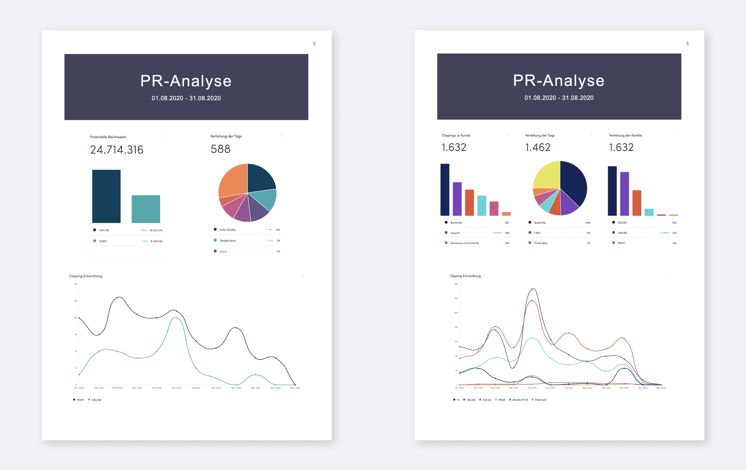
Last but not least, the third component of aclipp PR reports: analyzing PR performance. This works best with custom charts. aclipp provides these directly in the app as an interactive dashboard. You can check your work's performance anytime and optimize it based on data. These evaluations can also be used in the report.
Which analyses are included in the report is up to the users themselves. This ensures that only the charts relevant to the recipient make it into the report. A PR report should not be overloaded with numerous pieces of information but should provide only the most important information relevant to the reader. This ensures that the PR report is read and thus fulfills its purpose.You can find out what else is important to create a meaningful report here.
Especially this third section enables strategic communication decisions based on the report. This is because goal achievement can be visualized very well, making trends and developments visible at a glance. This way, you can optimize your PR data-driven and take it to the next level!

In addition to the many content elements such as KPIs, analyses, or clippings, users also have the option to customize the layout. The report's color can be adapted to a CI, a logo can be added, or a title image can be inserted for the first page of the PR report. This allows PR managers to adapt the PR report to their own CI or that of their clients. Clients should find themselves in the report and be able to identify with it.
The images here show just one of many design options. With the aclipp PR report generator and the individual dashboard, you can do so much more and have numerous possibilities. There are too many to show here 😄
Therefore, I would say: just try it out yourself and see what the aclipp PR report generator and the many other functions of aclipp have to offer! You can easily create a free account via the link below and start experimenting right away. Challenge the app and see how it would create your PR report 😉 One thing I can guarantee: aclipp is faster than you when it comes to creating PR reports 🚀

Sarah Amler
Digital Process & Marketing Manager
Sarah was responsible for performance marketing, social media activities and digital onboarding in our software at aclipp.