Charts for reports
You can now add charts to your reports.
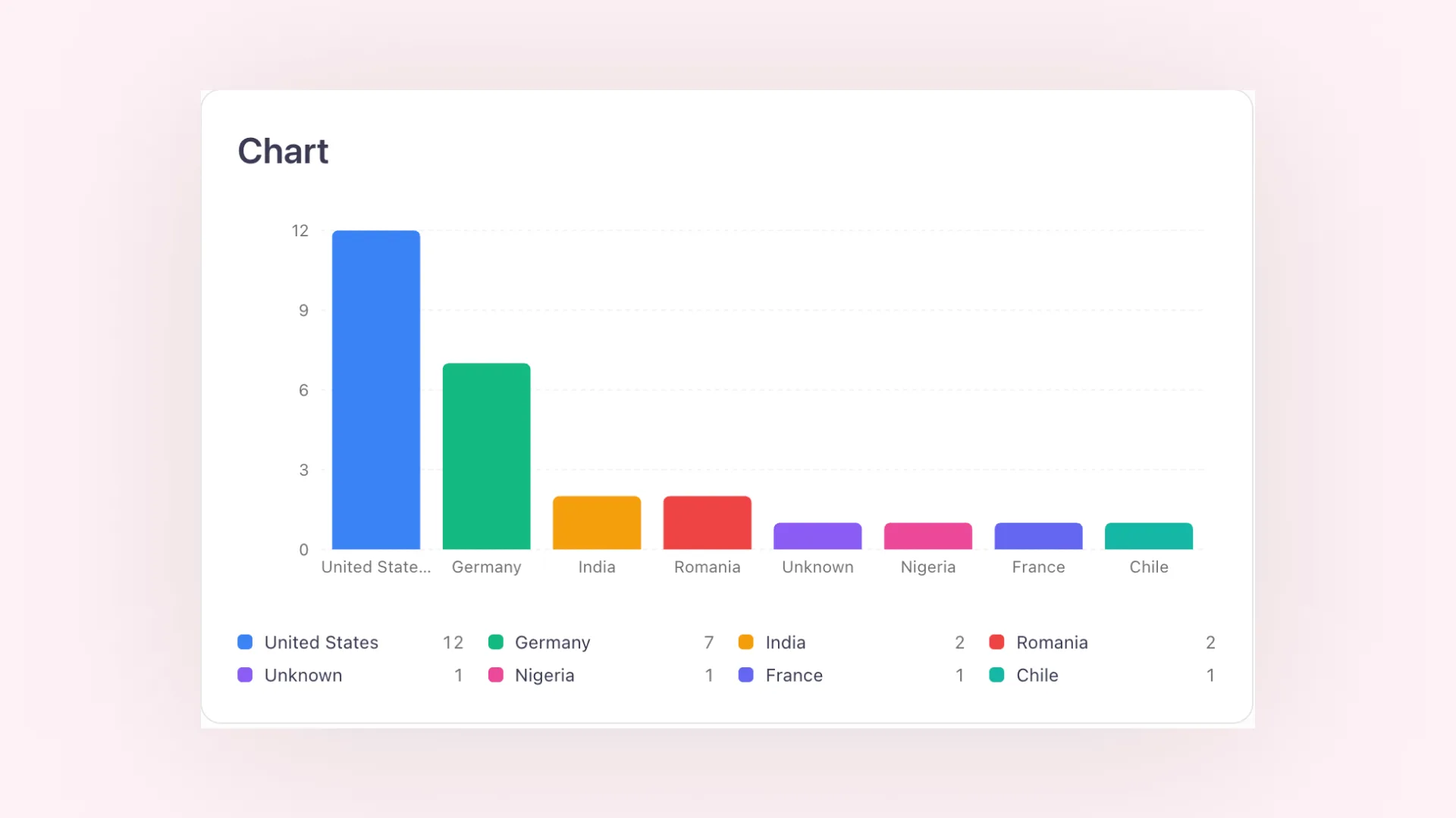
Pick a donut, bar, or line chart to show how your coverage breaks down, by outlet, country, channel, or tag, or how a metric like media value develops over time. Each chart is its own report block with its own filters.
On the web, charts are interactive, so you can hover for exact values. The exported PDF shows the same charts and legends, so your report looks the same whether you share a link or send the file.